Dani Spinage (Service Designer) and Hannah Chan (Content Designer) talk to us about the work they’ve done on the report a concern about a child journey on Essex.gov and how they brought together their two disciplines to solve a problem.
Making sense of the brief
We were contacted by the Children and Families team to look at the content they have to support users in understanding when and how to report a concern about a child.
They processed around 43,000 requests for support relating to concerns about a child last year, and this figure is rising each year. Most of these requests were raised by professionals. It takes on average 45 minutes for a professional to raise a request and around 2 hours for the team to triage it.
However, 85% of these were triaged and found to need a level of support that the professional could have accessed themselves.
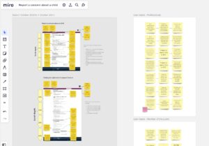
In order to make real improvements to the content, we wanted to understand how it works as part of the wider service. We set out to a discover more about who the users are, what they need to do and what their journey looked like, as well as the issues the service were facing.
Understanding the users, their needs and their journeys
At this stage, there wasn’t any user research resource available, so we had to use other methods to help us understand the problem.
We spoke with the service and learned that there are 3 distinct user groups:
- professionals
- members of the public (including family members)
- children and young people
While the needs of members of the public and children and young people differed only slightly, they were significantly different to the needs of a professional.
We used analytics to piece together how users were navigating through our content to help us understand their journeys and identify pain points.
Synthesising what we were seeing
We pulled together our findings to identify a few key areas that were contributing to the problem. We out found that:
- we were trying to serve different user groups with different needs with the same content, leading to a confused journey
- the content layout was confusing and wasn’t helping users find what they need, resulting in 45% of users navigating straight to making a request for support
- only 8% of users were looking at the pages that detailed when a request was required and what support and services could be accessed without raising a request
- there is support available to professionals that we weren’t advertising as it wasn’t applicable for all user groups
This helped us define a ‘How Might We’ statement that we could develop our ideas for improvement against:
How might we help professionals better understand the support that can be delivered without needing a request to be raised?
Designing an improved user journey
To help professionals better understand the support that was available, we knew we needed to provide targeted content for them.
We came up with different ideas on ways to do this, but settled on splitting the content into 3 sections, one for each user group. We’d seen other local authorities doing this and felt it worked well.

Splitting the content in this way meant we could create a targeted user journey for professionals.
We could guide them through the information and services they could access through self-serve, without needing to raise a request for support.
We could also explain the steps we would expect them to take before raising a request, without confusing the journey for members of the public and children and young people.
It also meant that we could include more information on other support services that we offer to professionals that hadn’t previously been included.
Splitting the content by user group also meant we could create a new section specifically for children and young people where we could flex our tone of voice and language specifically for this audience.
Getting feedback on the design
Throughout the design process we met with the service to get their input on the design.
As we couldn’t speak with users at this stage, they were able to provide insights on things like the language that professionals use and understand.
As well as speaking with the service, we also took our work to a Get Feedback session, which we regularly run within the Service Transformation team.
We wanted feedback on the new content, the user journeys and whether we had made the request for support form difficult to find. We got some great comments and feedback on things we hadn’t thought of.
This included our use of the term ‘professionals’ and whether those in a voluntary role would recognise that they fell under this user group. Based on this feedback we renamed the section ‘professionals and volunteers’ and provided some further clarity in the description.
The launch is not the end, it’s just the beginning!
The redesigned report a concern about a child content and journeys went live at the end of October.
We’ve set up a performance measurement framework to measure the impact of our changes. This includes the objectives we would like to achieve, the metrics we will collect as indicators, the tools and data we’ll use to measure them and what good looks like.
We collected baseline data before the launch and will compare this with the data we’re collecting after launch. We’ll use this to continue to iterate the content based on what we learn.
Understanding what the data is telling us is only one part of the journey
The other side is understanding the story behind those numbers. One of our user research colleagues has started engaging with professionals to carry out some usability testing.
This will help us understand how professionals use our content and whether the changes have had a positive impact on how they navigate our support and guidance.
Working together to solve a problem
This piece of work came into Service Transformation as a content project, but we recognised that a service designer could help piece together how the content contributed to the wider picture of the service.
It’s not always possible to have multiple disciplines working on a project. But bringing together our different skills enabled us to approach this problem in a more rounded way.
This will help us to make sure that the changes we made meet the needs of our different users in the best possible way.
It also helped us personally appreciate and learn more about the different skills and expertise each of our disciplines brings to User-Centred Design.
We’d love to hear about other small projects where different disciplines have paired up to tackle a problem.
Leave a comment