We’ve been so busy that it’s beginning to feel a long time ago now, but at the start of March we unleashed a suggestion of what we thought the new intranet may look like.
In the run-up, we’d assembled a team of ECC employees to test it for us. Sourced from all over the organisation, close to 100 people signed up to take part in a variety of testing and feedback exercises that were going to run throughout March – the private beta testing period.
The Research Plan
In research terms, we put together a plan for an iterative, mixed methods project – this means we were going to look to collect quantitative and qualitative data in a variety of ways, and we’d change the plan over the four weeks if some activities were proving more useful and effective than others.
And behind the scenes we were going to be working closely as a design team to make sure we could react as quickly as possible to the feedback that came in.
Hang on - what does private beta actually mean?
The ‘private beta’ period means that we’ve created a first version of a new site, and made it available for a limited group to see and to use. It’s very much a draft product so we can tweak it and reshape it according to the feedback that we get. Basically, it’s a learning tool for a design team so that we can decide what does and doesn’t work for our users.
What did we find out?
Firstly, we found out that ECC employees are actual superstars.
We had originally thought we’d get about 30 testers. Then we thought we might be able to hit 50, and could get some really good robust quantitative data out of that. When the numbers kept climbing, we decided to take as many volunteers as we could get, knowing that that was only going to improve the quality of data that we received.
Our first draft of the new intranet was seen as an improvement, but missed the mark in some key areas
During the first week of private beta, we asked our testers for their initial feedback. As not all of the site’s content has been migrated, the feedback largely centred around the look and feel of the site, as well as some of its central features.
The first week’s feedback was incredibly useful, and while the majority of it was positive, we learned a huge amount about how to make some really valuable and important improvements.
We heard that:
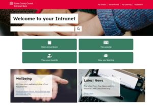
- Testers felt that the new layout was clear, bright and modern
- There was agreement that it looked easy to use
- The ‘quick links’ to systems like My Oracle, Assyst and My Learning were popular
- The sense of community that ECC staff feel was lacking
- There was too much scrolling to get to useful content – in particular, news was too far down the page
- The search tool could ‘make or break’ the intranet – if it doesn’t work well, we could consider the site a failure
Once we’d gathered that feedback – which came through a dedicated MS Teams channel as well as through a short survey that went out to all the testers – we met as a design team and started to implement some changes.
Usability Testing Sessions
Having so many testers available meant that we could do a variety of activities and cover lots of bases in a short time. As well as the pulse surveys (regular but very short surveys) and collecting feedback through Teams, we set up usability testing sessions – 1:1 video calls where we can explore a certain aspect of the site in more depth.
We ran three series of these sessions.
Firstly, we ran ten sessions that showed participants a second iteration of the intranet which included the changes that we had made after receiving their initial feedback. We also used these sessions to find out more about the idea of community, the sense of pride that ECC staff have in their work, and how the intranet can better reflect that.
Then we ran five sessions that looked specifically at the new intranet on a mobile. From a researcher’s point of view, these are challenging sessions as the technology is difficult. Participants have to join the call from both their laptop and their mobile, and it seems you need to possess a secret combination of luck, patience and Bill Gates’ personal blessing to get this to happen. But the Microsoft gods were smiling on us, and nearly all of the sessions went without a hitch.
During these sessions, we looked at how easy or difficult it was to navigate the site from a mobile and we were pleasantly surprised – tweaks made after earlier rounds of research had made it much easier to use. We were able to use these sessions to evaluate our ‘quick links’ buttons - when space is at a premium on a mobile site, it was extremely useful to see how participants preferred that space to be used.
Finally, towards the end of the beta period, we ran six more sessions that looked at the new wellbeing content. We looked at how the pages are structured as guides, and how intuitive they are to use. We had some extremely valuable feedback from this exercise, and we’re redesigning how these pages are going to work.
“You said, we did...”
Here’s a list of the main points of feedback we received and what we’ve done as a result:
| You said… | We did… |
| The banner at the top of the page was too big and wasting space | Reduced the banner size, removed the text and made the banner functional – imagery was less important to users than functionality |
| News was too far down the page | We’ve moved the news section higher up the page |
| You are going to miss the news carousel | We can’t replace the carousel because of accessibility issues but the content won’t be static and will feature three different articles |
| The home page wasn’t quite right – too much scrolling was needed to get to useful content | We’ve changed the styling of the home page making it more space-efficient |
| It wasn’t clear what were links to information and what were links to actions | We’ve changed the ‘quick action’ links and moved them |
| The white/red contrast was uncomfortable as the white space was too bright | We’ve looked into dark mode but it’s not feasible, so we are exploring using ‘Visual Calm’ to enable the brightness of the white background to be altered |
| You need a quick link to the staff directory | We are using a new type of directory and we’ve added a link from the homepage |
| You want the search to work | We are using a new search engine and we are doing a lot of work on it to make sure that it works as well as possible, including giving clickable suggestions |
| You don’t want to the search to bring up out of date information | We are only migrating in-date content and looking into a filter for the search results |
| The community at ECC is important – the news and the CEO’s blog is a big part of this | We have explored ways of reinforcing the idea of community at ECC and we will make the CEO’s blog is easy to access |
| The text is too small on the homepage links | We are changing the structure of how all the content is presented, by reducing the number of top-level categories to three, and making sure the text is big and clear |
| The wellbeing content is good but the tone of voice is ‘business-like’ and the crisis information isn’t immediately available | We are reworking the content to make the tone more compassionate and warm, and we have added information about what to do in a crisis in several places. |
| The way the policy information is structured is not clear | We are reworking how the ‘guides’ are presented on the pages, including breaking down text-heavy pages and restructuring the guide contents list so it is more navigable and its purpose is more clear |
What next?
We’re now counting the days down until the next new version of the intranet goes live. Thanks to our testers’ feedback and their incredible engagement in our project, we’ve come a really, really long way. The decisions we’ve been able to make thanks to the testers’ input means that our first draft was really just that, and we can be confident that we’ve been able to make some really good decisions about what the new intranet will look like when it’s ready for all ECC employees to use.
So we’re now heading into the public beta phase, which means the beta (think of it as a working draft) version of the new intranet gets released to everyone with no limitations on who can see and use it.
And the testing’s not ending there. We’re just about to start some research on the news section of the intranet so we can make some improvements around how that’s being delivered and received.
And once the intranet goes live, we will continue to revisit and make sure it’s the best it can be. To make sure that it’s working well for all ECC employees (and whoever else chooses to look at it, because it will be a public-facing site for the first time), we will look at how people are using it, where it’s working well and where it could do with some more refinement and improvements.
Before we sign off – a huge thank you goes out to all the private beta supertesters who made the month of testing really, really good fun and extremely productive. To see the fruits of their labour, keep your eyes peeled for ECC intranet 2.0!
2 comments
Comment by Bob Davison posted on
Brilliant work Claire and great blog. 🙂
I know how hard you and the Intranet team have been working to make the site really meet the needs for users across the council and beyond.
Comment by Mick Hutton posted on
I think it is great that this amount of effort is going into getting the intranet as useful as possible for the majority of people. Well Done!