In the old days, building a digital product meant weeks, months, or even years of frantic work behind the scenes before a ‘launch’.
Just as with our interstellar colleagues, this would be the focal point of all the hard work and testing.
The countdown would start, a clammy hand would linger over the big red button. A quiet hush as the numbers run down and your pride and joy is fired out in to the world.
No more.
As Mikey Dickerson points out, “It’s just a website. We aren’t going to the moon.”
Making something live is just one step in a journey of 10,000 steps. We’re looking for a minimum viable product (MVP), not the Millennium Falcon.
When it’s good enough, it’s good enough. Sharing what you’ve made is only a big deal if you make it a big deal.
It doesn't have to be perfect
When the scale of the response required to help our communities in the face of the coronavirus (COVID-19) pandemic became apparent, we tasked ourselves with delivering a digital product at speed.
It didn’t have to be perfect, it just had to work for the user.
As the Product team, we took the lead in forming a team to do this. We talked to stakeholders about issues that their users were likely to face and how we could help them.
Collaborate and borrow
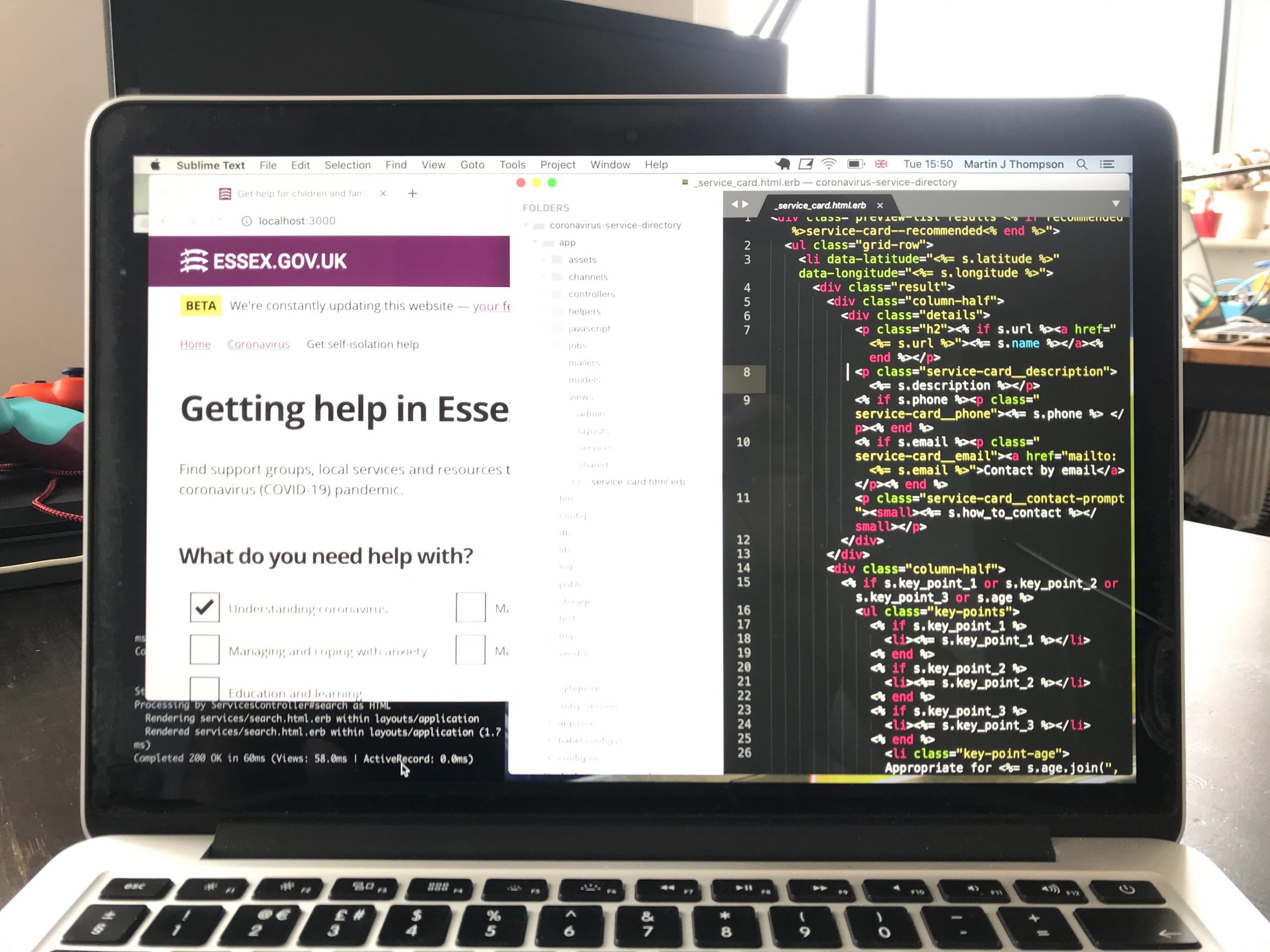
It was starting to look like a simple, open-sourced directory of services and resources that would help children and families during lockdown.
As our team was finding its feet, we were also building the greater team with Clare Burrell, Harriet Pickering and Annabel Ostridge at Children and Families commissioning. Together we started to shape our understanding of how the application could be used and how soon we could get a workable directory live.
There was a lot of scope for collaboration with other councils who’d done similar things. This helped us get to an MVP much quicker.
We were working at a fast pace and learning a lot. Importantly, we borrowed wherever we could.
We used code from Camden and Buckinghamshire. We know these organisations and we trust them. They’d done the hard work and were happy to share it. It made sense to use this as the foundation for what we were building.
Collaborating, sharing and borrowing like this meant that we could take massive leaps towards something that was good enough to share with the public.
It’s not the wild west
Now, just like this isn’t a space adventure, it’s also not a western. We don’t just go around building stuff on the quick draw.
Sometimes it felt like we were cheating. Things changed fast and it seemed lawless. Even though it may have looked chaotic from the outside there is a process that we followed. That said, we weren't dogmatic.
It was important that our stakeholders understood this too. If they didn't have confidence in the way we were delivering things, then everything would start to get stuck. They might have missed the old way of working with a colour-coded plan and a ‘go-live’ date pencilled in for the distant future. But in the majority of cases this won’t deliver what you actually need, certainly not in a short timeframe.
Working in the open helped. This wasn’t just to impress stakeholders with clever stuff. It was to make them understand how it was going to work and to see it working.
This meant that when we reached the point where we were happy to share it, they were totally confident in us and the product.
Countdown to launch?
Going live with something that you’ve worked really hard on and you genuinely believe is important is still tough.
We’ve seen lots of projects where last minute bugs or requests for more features have marooned products for weeks in go-live limbo.
Not this one though. When one of the stakeholders asked the fateful question, “When is the exact go-live date?”, we were able to say, “It went live this morning.”
Obviously we weren't flying blind. We had ideas of what to expect. We have the experience, but with that experience, we needed to be careful with assumptions and be prepared to fail and learn.
What happens next?
The next stage might be eventful, challenging, exciting, disappointing or all combinations of the above. Some experiences we may face for the first time.
Every product and every team is different. What feels good is we delivered something quickly while working remotely, even when some of the team fell ill.
On a journey like this, no step is more important than another. So that means that after go-live, our work doesn’t stop. We iterate, test and iterate again.
And just like magic, the product keeps on getting better. One small step at a time.
3 comments
Comment by Mr M P Cole esq posted on
Great to see! Well done all 👍
Comment by MrMobodies posted on
It looks perfectly fine to me at the moment.
What I don't want to find are visually annoying UI stuff and decorations that I am seeing a rise as of recently.
Like unclosable spammy fixed headers/toolbars and widgets stuck over the contents that I find very distracting and don't want there when I am trying concentrate.
Dimming overlays, where a dialogue appears somewhere and rest of the page dims which hurts my eyes when it flips from light to dark to light and so on. Some websites do this on mouse hover or just typing in a search form.
Loading spinners in the form of animated GIF images used excessively for page loads or things that only takes seconds or even less. That annoys me in two ways, if it is slow the spinner goes around and around and around. If it is fast it flashes after every page load or event. If it hangs whilst going around it tells me nothing useful. I've seen proper spinners in the past for websites there were genuinely slow to load on first load, a small spinner that spun only once linked to the real loading progress. I also find them a nuisance when it is combined with a dimming overlay that covers up a form with the details.
Animated skeletons and placeholders that seem to slow the page load down until I hid them.
I have to rely on extensions to such as element hiders and header hiding tools which sometimes don't always work.
Lots of white spaces and where I have scroll more to read less. Then sometimes the UI graphics can be very large so when I zoom out to a sensible size the text becomes too small to read.
On this page I had to do no element hiding or rely on any tools and I did not get annoyed.
It looks simple but not oversimplified or dumbed down.
Comment by John Newton posted on
Thanks for your comment! This is really good to hear.
Simple, but not oversimplified is a great way to describe what we're trying to do. Our aim has always been to make things clear and accessible.
We're definitely fans of scalable content that's clear and has proper colour contrast. Not so much of flashy UI stuff that gets in people's way.
Our front-end devs Martin and Jack wrote a bit more about this in another blog post: Accessibility awareness: just because it's not broken, doesn't mean it's working